Turn Every Commute Into a High-Impact Brand Moment
Fleet vehicle wraps can turn normal traffic into real brand attention. Every time your truck, van, or service car rolls through summer congestion, people are looking, even if they do not realize it. That quick glance is a chance to share who you are, what you do, and how you help.
When we team up with you on fleet graphics, our shared goal is simple: make every mile work harder for your brand. The trick is simple to say but harder to pull off: design around how people actually see on the road. Not on a computer screen, not parked in a lot, but moving at real speeds, in real weather, with real distractions. When we plan wraps around moving sightlines, your fleet stops being rolling wallpaper and starts performing like a street-level ad-network that continuously builds recognition and trust.
In this article, we will walk through how moving sightlines work, how to design for 65 miles per hour, how to use your routes as a planning tool, and how to think of your fleet as one connected brand system instead of a bunch of separate vehicles. Our aim is to give you practical, immediately usable ideas that elevate both the look and the impact of your graphics.
How Moving Sightlines Shape Real-World Brand Visibility
Moving sightlines are the natural paths people's eyes follow as your vehicle approaches, passes, and pulls away. On the road, no one is staring at your wrap for long. They are scanning traffic, road signs, brake lights, and their GPS. Your graphics live inside that tiny window of attention, and that is where we want your brand to stand out.
There are a few key view moments to plan for:
- Front approach at a distance
- Side view while passing or being passed
- Rear view in slow or stopped traffic
- Multi-level views in city streets and parking decks
From the front, people often see only your hood, upper grille area, and maybe part of the windshield area. At that stage, clear color, a strong logo, and a simple brand cue work better than lots of text. The goal is quick recognition, not full storytelling. When this moment is optimized, commuters start to recognize your vehicles instinctively, building a foundation for stronger brand resonance.
On the side, sightlines slide along the beltline of the vehicle, usually from front wheel toward the middle. In moving traffic, most people catch 1 to 3 seconds of your wrap. That means:
- Short, bold wording stands out
- Big, simple shapes beat tiny details
- High contrast colors are easier to read in a flash
The rear view is your longest and strongest moment. In stop-and-go traffic, drivers sit behind you and actually have time to process a clear message. The back doors, rear glass, and area above the bumper are prime spots for your logo, a short line about what you do, and a single way to get in touch. When this space is used well, routine congestion turns into repeated brand impressions that deepen recall and drive response.
The key idea: a fleet wrap should not just look cool in photos. It needs to perform at 15 mph in a parking lot, 45 mph on city streets, and 65 mph or more on highways. That is why we focus on how the design behaves in motion, not just how it looks standing still. This performance mindset turns your graphics into a working asset, not just static art.
Designing Fleet Vehicle Wraps That Work at 65 Miles Per Hour
When we design for speed with you, we follow a simple rule: less but louder. Every extra line of copy, every tiny icon, every extra phone number fights for space and slows down understanding. At highway speed, people only catch the biggest, clearest parts, so we make those elements do the heavy lifting.
A strong wrap usually has:
- A clear logo lockup that reads from distance
- One short message about what you do
- One primary call to action, not a long list
Font choice matters more than many people think. Thin script fonts look great in a brand guide, but they can vanish at 65 mph in bright summer sun. We look for clean, bold type, with enough stroke weight that letters stay solid, not wispy. Strong contrast, like dark text on a light field or light text on a dark field, keeps the message readable through glare and shadows, so your core promise stays visible in the moments that count.
Color blocking is another big factor. Large fields of color can frame the logo and message so the eye lands on them fast. Busy photo backgrounds or fine textures can compete with the words and logo, especially when the vehicle is in motion. By simplifying the field and sharpening contrast, we help your brand feel stronger, more confident, and easier to remember.
Placement is just as important as style. We aim to keep key elements in natural sightline zones:
- Upper side panels and mid-door areas for logos
- Rear doors and the space just above the rear bumper for core info
- Wide, flatter panels instead of low skirts or tight curves
Route type also shapes design choices. Long-haul highway fleets might lean harder on bold logos and simple rear messaging. Urban routes often benefit from strong side graphics for passing traffic and pedestrians at crosswalks. Campus or facility shuttles can support slightly more detail, since viewing distances are shorter and speeds are lower. By tuning design to how and where you operate, we help each vehicle deliver more visibility and stronger brand presence.
Mapping Traffic Flow to Smarter Fleet Wrap Strategy
Your routes are not just lines on a map; they are a planning tool and a growth opportunity. When we look with you at where and how your vehicles move, we can shape wraps around the highest-impact moments and turn everyday patterns into brand-building runs.
A simple process looks like this:
- Map major daily and weekly routes
- Note peak travel times and typical speeds
- Mark areas with heavy foot traffic or frequent stops
- Look at where vehicles sit parked and how they are seen
Busy school zones, event districts, warehouse clusters, and retail corridors often deliver strong visibility. If your vehicles pass these spots again and again, your wrap should be tuned to those environments. For example, rear-door messaging becomes even more important on routes with long red lights and frequent congestion, while side panels become key in dense pedestrian areas.
Seasonal patterns matter too. In summer, bright sun, glare, and longer daylight hours change how your wraps are seen. Decision points shift as well, with road work detours, tourist traffic, and more weekend driving. When we plan graphics with you for extended daylight and heavy seasonal movement, we can align color, contrast, and message length with real conditions on the road. That alignment helps keep your brand looking fresh, relevant, and highly visible through changing traffic patterns.
A dedicated fleet graphics partner can help you review where your brand is already being seen, then adjust layouts, copy, and deployment so every mile works harder. Our role is to turn your existing movement into a more powerful, measurable brand asset.
Turning Your Fleet Into a Coordinated Moving Brand System
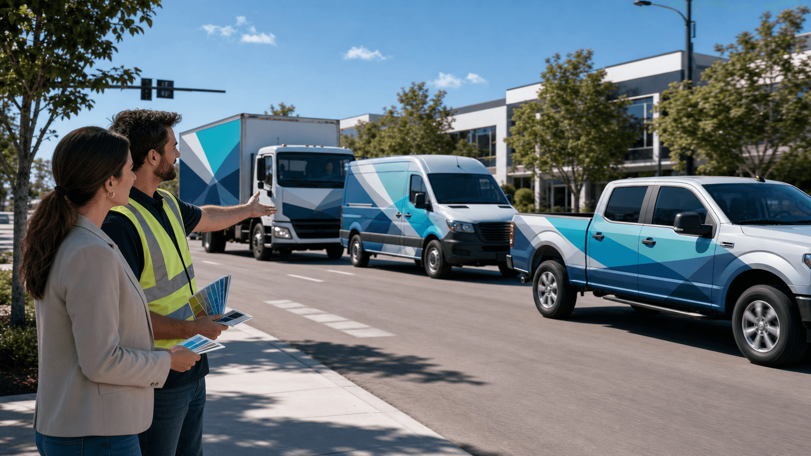
One wrapped vehicle is helpful. A coordinated fleet is powerful. When your trucks, vans, and service vehicles all echo the same story, your brand becomes easier to recognize at a glance and feels more established in the markets you serve.
We like to think in terms of role-based wraps:
- Hero vehicles with full wraps and bold messaging
- Support vehicles with simpler, identity-focused layouts
- Specialty units that carry campaign or seasonal graphics
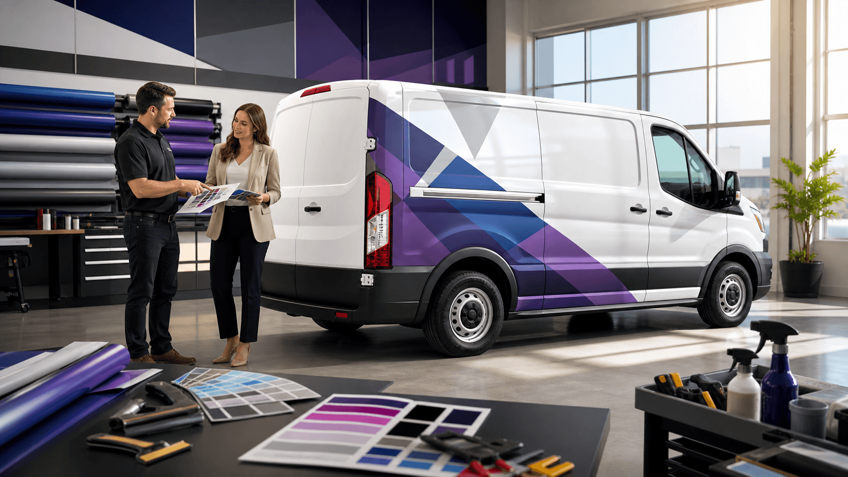
This mix lets you keep the brand consistent while still adjusting to vehicle size and purpose. A small service van might carry a tight version of the brand, with a big logo and short message, while a large box truck becomes a hero unit with full imagery and a larger story. Together, they create a moving system that reinforces your presence across neighborhoods, campuses, and regions.
The secret is consistency in the right places:
- Color that matches across units
- Shared typography and logo structure
- Repeatable icons or patterns that signal your brand
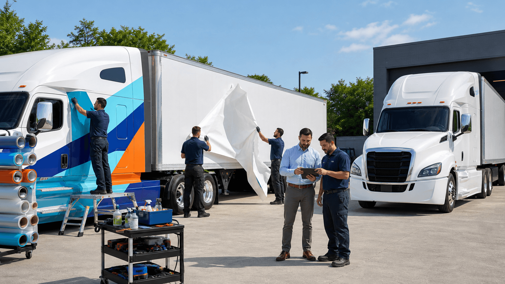
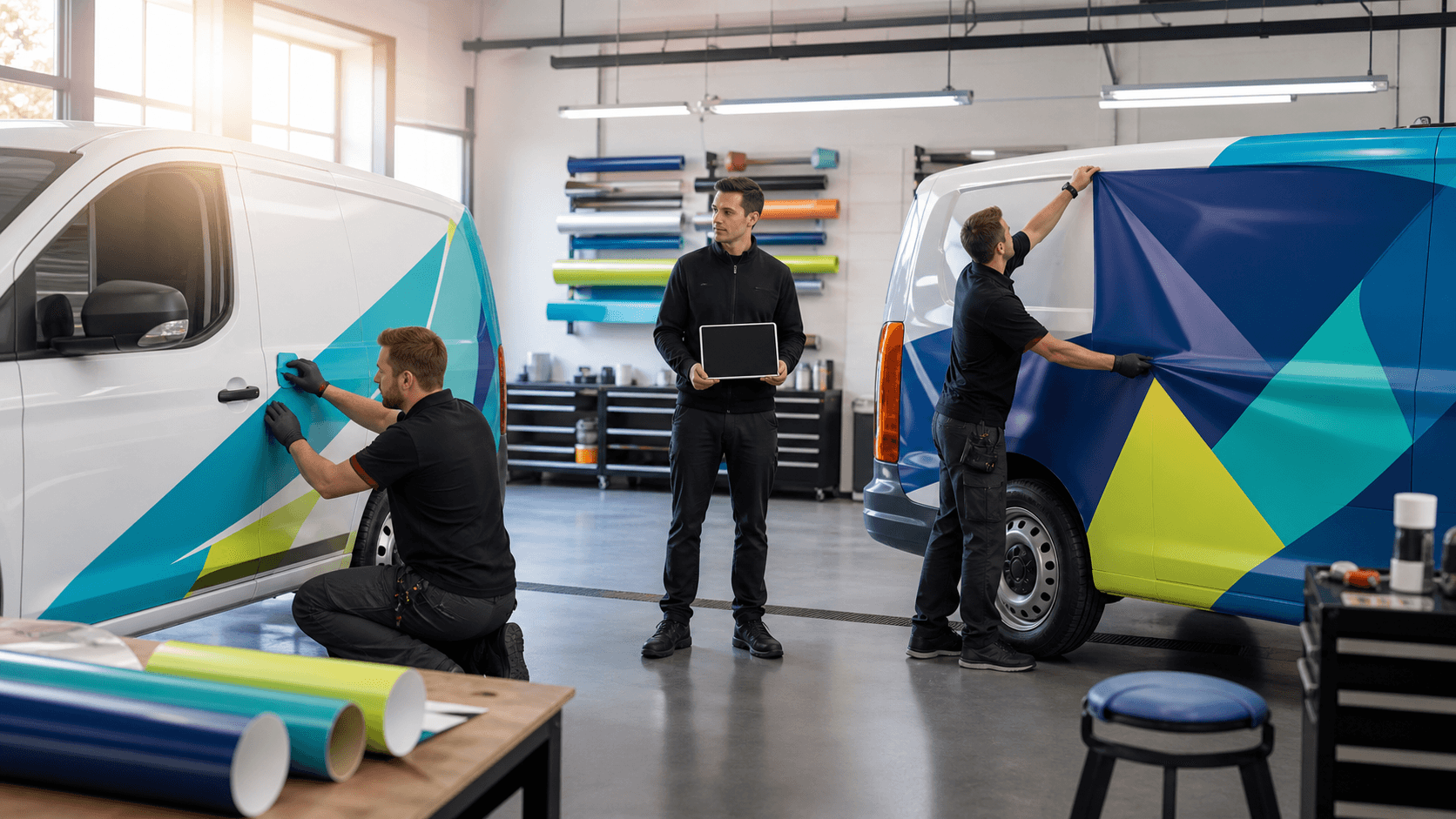
Quality materials and skilled installation keep those elements aligned and clean. Harsh sun, summer storms, and daily wear can fade or damage wraps over time. When graphics are printed with care and installed by experienced teams, your fleet stays bright and sharp longer, so every vehicle supports the same strong first impression. That level of quality control protects your investment and keeps your brand showing up at its best.
From Static Art to Moving Performance
Fleet vehicle wraps work best when we treat them as moving performance tools, not just pretty art on metal. Every mile gives you a new audience. When your design respects moving sightlines, real speeds, and real routes, that audience finally sees what makes your brand clear, memorable, and different.
A useful next step is to watch just one regular route with fresh eyes. Notice where people sit behind your vehicle, where they pass you, how sun and shade hit the panels, and how long key messages are visible. Often, small shifts in logo size, font clarity, or rear-door layout can turn those moments into stronger brand hits and more consistent visibility.
When brands think this way, each vehicle stops acting like a lone unit and starts playing its part in a bigger, smarter system on the road. That is where fleet wraps stop being a static line item and start becoming one of the hardest-working brand tools you own, helping you extend your reach, strengthen recognition, and keep your business moving forward.
We are grateful to help brands make that shift. When you are ready to look at your fleet through this performance lens, we are here to collaborate, refine, and keep pushing your graphics to work harder with every drive.
Get Started With Your Project Today
Transform your fleet into a powerful branding tool with our custom fleet vehicle wraps designed to match your business goals. At AGS SEO, we work closely with you to create graphics that boost visibility and keep your brand consistent on every road. Our team is ready to guide you through design, production, and installation for a smooth, hassle-free experience. Have questions or need a quote fast? Just contact us to get started.