Turn Every Highway Mile Into Brand-Building Power
Semi-truck wraps are rolling billboards that work for your brand around the clock. Every mile your trucks run is a chance for your brand to be seen, remembered, and trusted. With a strong, well-planned wrap design, those miles turn into real brand power and deeper recognition.
Highways are demanding environments for any design. Your trucks are moving fast, other drivers are distracted, and light and weather keep changing. To succeed in that setting, your wrap has to be "highway-proof." That means it still works at 70 miles per hour, from hundreds of feet away, on sunny afternoons, rainy nights, and everything in between.
At AGS SEO, we think of highway-proof design as a system that runs on three core pillars: legibility, contrast, and message hierarchy. When those pieces are dialed in, you can take one strong design and scale it across an entire fleet without losing clarity. Summer and peak travel season make this even more important, because more cars on the road mean more impressions and more opportunities to strengthen brand visibility, especially before the heavy shipping push later in the year. We work with you to make sure every one of those impressions counts.
Designing for 70+ MPH: How Distance Changes Everything
Designing semi-truck wraps for highway speeds is very different from designing a brochure or a storefront sign. You are working with:
- Motion blur from trucks and cars moving at different speeds
- Changing lane positions and viewing angles
- Height differences between cars, pickups, and other trucks
- Very short windows of attention, often only a few seconds
We look at something called functional viewing distance: the real distance where most people can actually read or recognize something on your trailer or tractor. At that distance, tiny lines and thin letter strokes can break apart, and small logos can lose impact.
To support your brand on the highway, you want:
- Fonts with strong, simple shapes and thick strokes
- Logos sized large enough to be clear from hundreds of feet away
- Photos or graphics that use bold shapes, not small details
Simplicity wins. Fewer elements, larger type, and clear blocks of color consistently perform better on the interstate than crowded layouts stuffed with photos, taglines, and extra copy. Summer adds another twist. Glare off white trailers, longer sun exposure, and dust or road film can all soften a design. Clean, high-contrast layouts help your message cut through that summer haze and keep your brand presence strong.
Building a Highway-Proof Message Hierarchy
A great wrap is not just big, it is organized. We like to build every layout around a simple three-level message structure:
- Primary: Who you are, your brand name and logo
- Secondary: What you do, a short line or key service idea
- Tertiary: How to respond, a web address or simple call to action
The primary message should be readable in one to three seconds at speed. That means the brand name and mark are the largest, clearest elements on the trailer sides and rear. The secondary message is for drivers who have an extra moment, maybe passing your truck slowly or sitting next to it in traffic. The tertiary message is for stop-and-go situations and yard time, when people can get closer.
Time-to-read is your friend here. Ask: If someone only sees this truck for a heartbeat, what do we want locked into their mind? Almost always, the answer is your brand identity, a clear impression that boosts recall and resonance.
Layouts also have to flex across:
- Tractors with smaller side areas and complex curves
- 53-foot trailers with big, open fields of space
- Shorter trailers where you have to compress the idea
We develop clear rules for where each layer of the message lives on each surface. That way, whether a driver is behind the trailer, beside the cab, or passing a shorter unit, they see a clear, familiar pattern that reinforces your brand. This is where close collaboration between your marketing, brand, and operations teams and our design and production teams really matters. When we align on the hierarchy upfront together, it becomes a repeatable system instead of a one-off design.
Contrast, Color, and Materials That Cut Through the Clutter
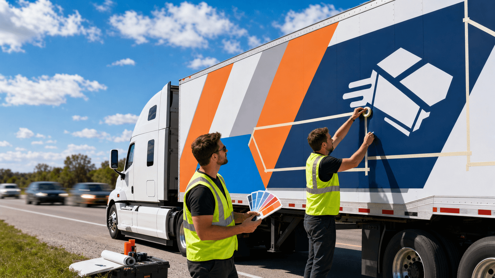
High contrast is your best ally on the road. At 300 to 600 feet, drivers are not seeing small details. They see light against dark, big shapes, and bold color breaks. If your logo color nearly matches your background, it can blend into the noise of traffic, trees, and buildings instead of standing out.
To stay readable and visually powerful, we like to:
- Pair light type on dark backgrounds or dark type on light backgrounds
- Add clean outlines or keylines around logos over busy photos
- Use solid color fields behind copy instead of placing text over complex images
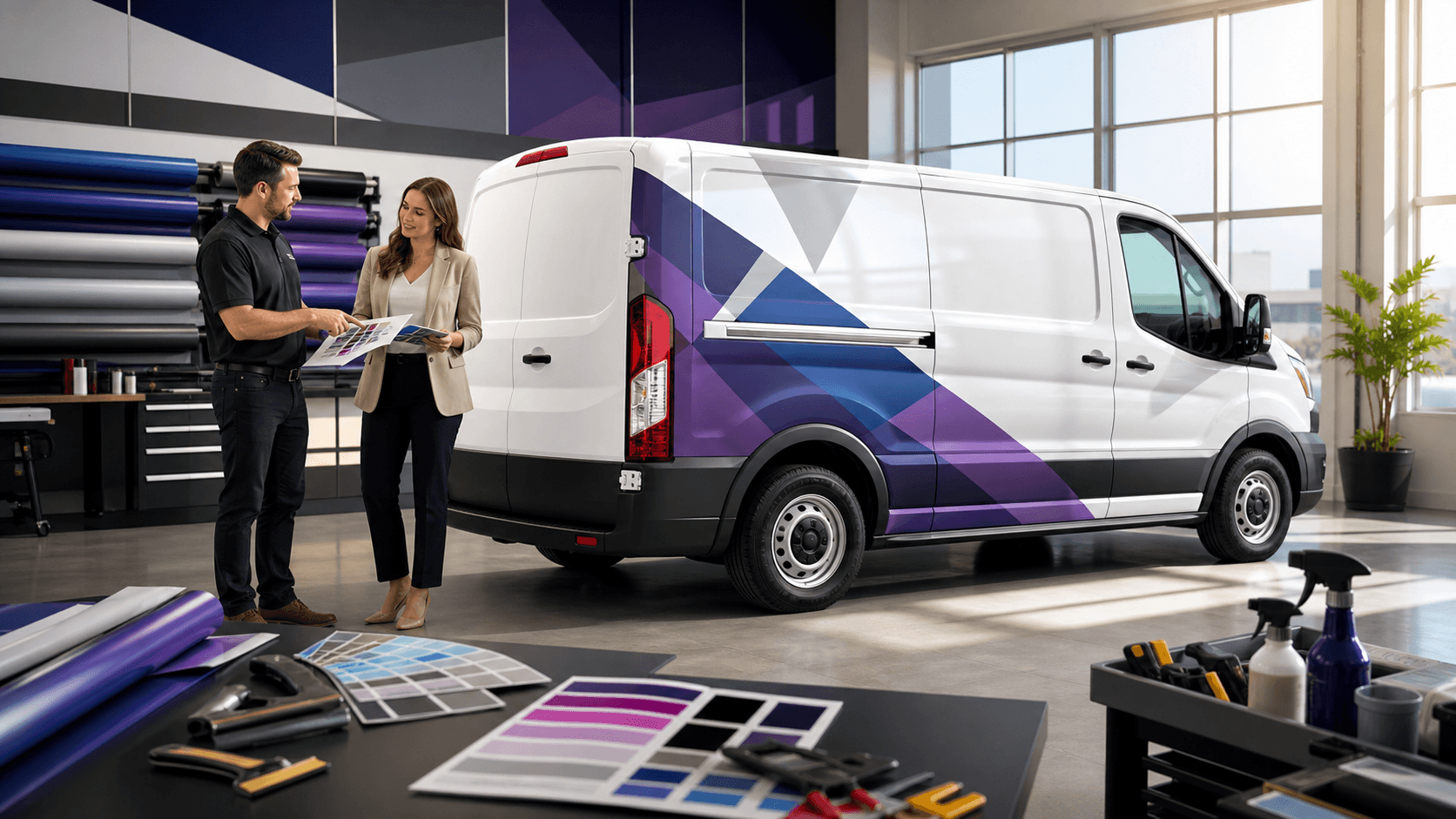
Brand colors can still shine; they just need to be tuned for highway-speed viewing. Sometimes that means slightly deeper shades, stronger contrasts, or a specific background block behind your mark so it does not disappear against gray skies or green roadside scenery. These refinements help your wraps amplify brand recognition in real traffic conditions.
Materials also matter. Quality print films and laminates help keep colors vibrant and lines crisp over time. Reflective or conspicuity elements can add visibility at night and support safety, especially on trailer rears and lower edges. Summer brings heavy UV, heat, and grime from long runs. The right material and finish help protect against fading, peeling, and loss of clarity so your wraps stay sharp and confident through the hot months.
A Scalable Design System for Multi-Location Fleets
For multi-location brands, a single great semi wrap is just the start. The real power comes from turning that one success into a design system that works across every unit and region.
A smart system sets rules for:
- Logo placement and minimum sizes
- Margins, safe zones, and no-print areas around doors and hardware
- Typography choices, font sizes, and line lengths
- Image zones where photos or local elements can change without breaking the layout
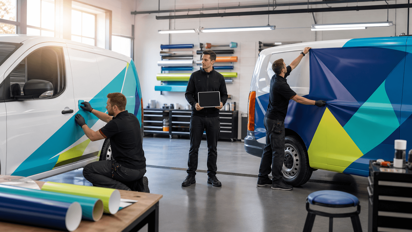
From there, we create templates tailored to each vehicle type. A 53-foot trailer, straight truck, sprinter van, and service vehicle can all share the same core look, even though their shapes and panel breaks are totally different. That consistency builds trust, strengthens brand resonance, and helps people recognize your brand faster, no matter where they see you.
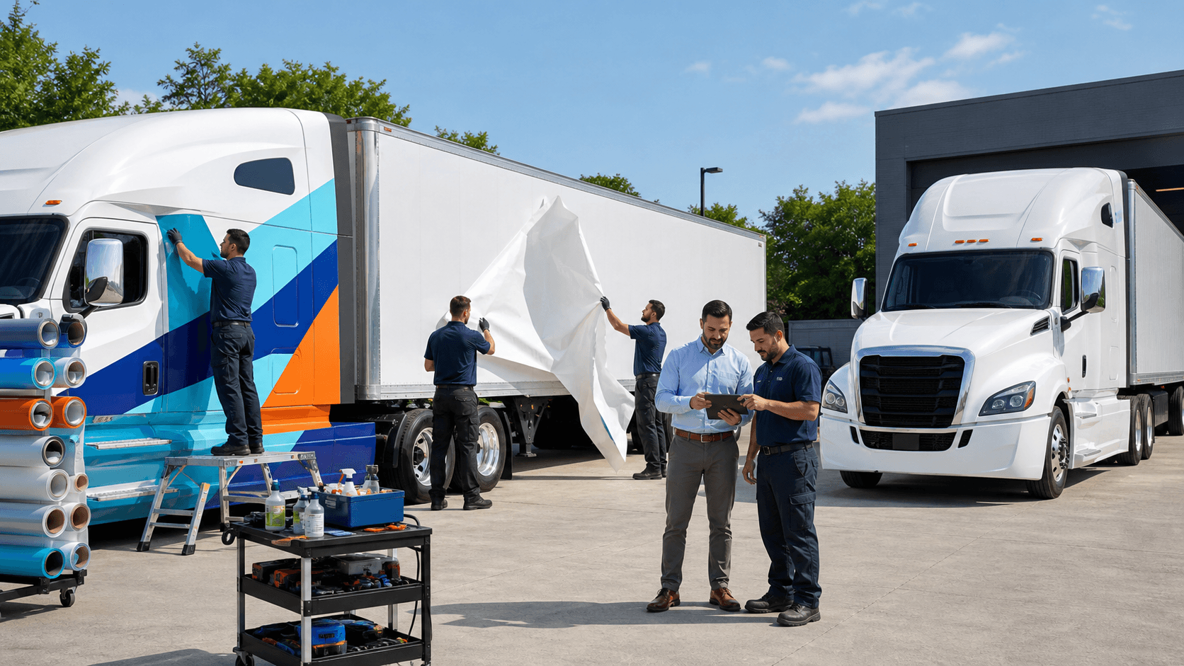
A strong national installer network then makes all this planning real. Different climates, shop setups, and driver schedules can complicate installs. When every installer understands the same standards and templates, edge-to-edge alignment, panel seams, and placements stay consistent from region to region.
At AGS SEO, working alongside American Graphics & Signs here in our home area, we treat design as a shared project with your marketing, operations, and local teams. Discovery, prototyping, test fits, and refinements all help us build something that works on the road, not just on a screen. We see every step as a partnership focused on bringing your brand vision to life in a practical, high-impact way.
From Concept to Cross-Country Impact with AGS SEO
If you already run semi-truck wraps, a smart first step is a wrap performance review. Look at tractors and trailers from the same angles other drivers see. Check:
- Can you clearly read the brand at highway distance?
- Does the main message stand out in bright sun and low light?
- Is there too much copy competing for attention?
- Do colors still feel strong and on-brand, or are they losing intensity?
Then, match that with your high-traffic routes and busy regions. Units that run major highways, dense metro loops, or key freight corridors are ideal candidates for a highway-ready refresh that maximizes every appearance on the road.
Summer and early fall are prime times to rethink design, update materials, and begin rollout so your fleet is dialed in for peak seasonal shipping and holiday freight. By working together on design, materials, and implementation, we can turn every mile into stronger brand visibility, better recall, and a powerful, consistent presence from coast to coast.
Get Started With Your Project Today
Transform your fleet into a moving billboard with custom semi truck wraps designed to fit your brand and budget. At AGS SEO, we work closely with you to create graphics that are professional, durable, and easy to maintain. Share your goals with us and we will recommend the right materials, design approach, and installation timeline. Ready to move forward with your next project? Contact us to discuss your options and get a quote.