Turn Doorstep Moments Into Brand Moments
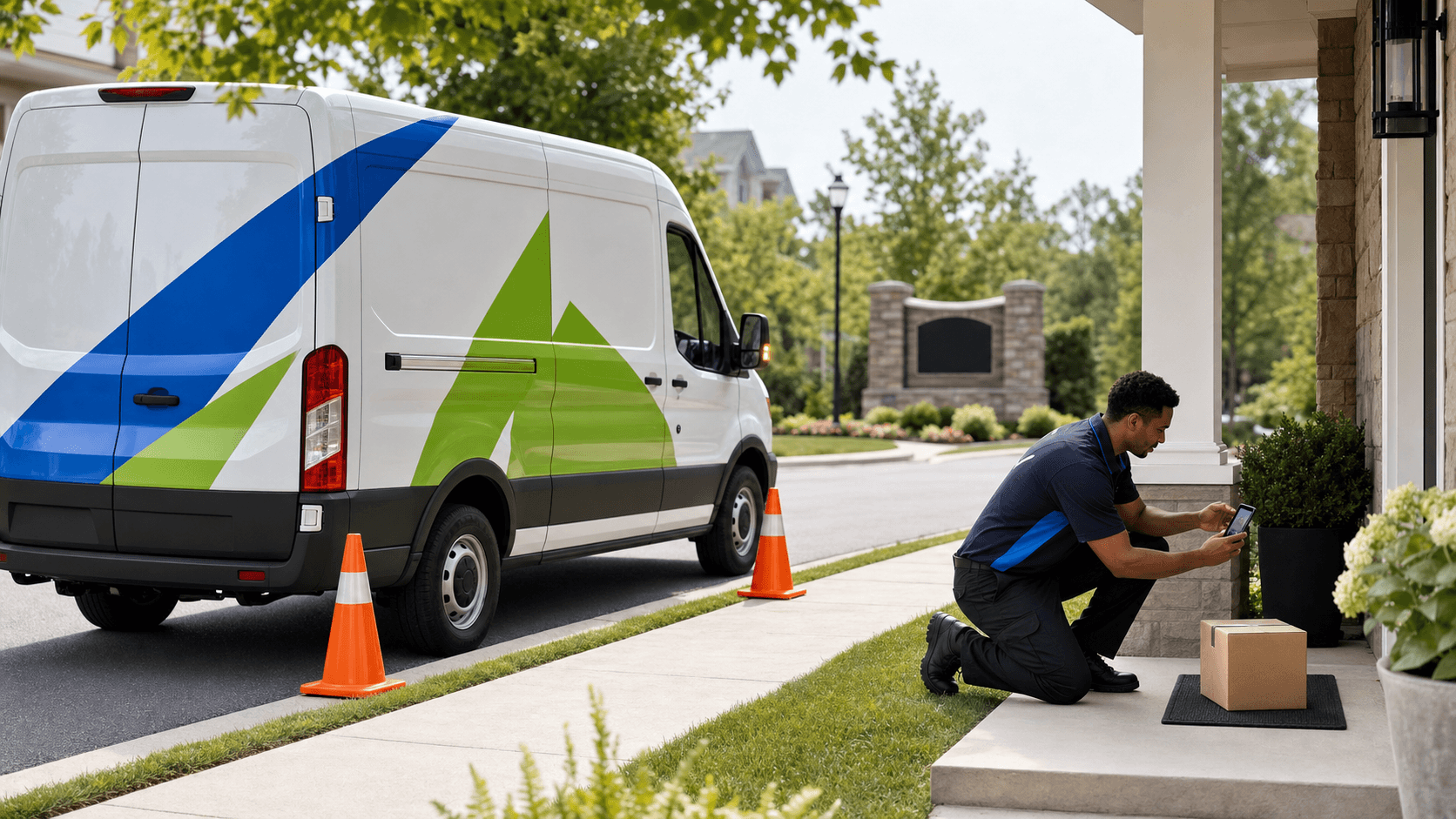
The last 30 feet from the curb to the front door might be the most important stretch of your route. That is when your van is parked near the house, your driver is moving fast, and neighbors are watching. Your brand is no longer a blur on the highway. It is right in front of people at eye level.
When we design fleet van graphics for last-mile delivery, we think a lot about those doorstep moments. With the right layout, your van can feel calm, trustworthy, and on-brand, even on the busiest day. In this article, we will walk through how to plan graphics for close-range legibility, photo-ready package drops, HOA-friendly design, and clear safety messaging that works in every season.
Designing Fleet Van Graphics for Close-Range Legibility
Many fleets plan graphics for highway traffic only. That matters, but last-mile work needs two kinds of readability: curbside and porch-step.
Curbside readability is what people see from down the street. Porch-step readability is what they see from 5 to 15 feet away, from a porch or window. Both need to work.
We usually think about type in layers:
- Large, bold company name that reads from the next block
- Short service line, like delivery, pharmacy, or grocery, close to the logo
- Simple URL or QR code, not a paragraph of text
- One or two contact options, not a full directory
For last-mile fleets, placement matters as much as size. We plan graphics so someone looking out a second-story window can read the brand name on the roofline area of the van, while someone standing in the driveway can read details placed lower on the side doors.
Lighting and weather play a big role too, especially in places with bright summers and long days. To keep fleet van graphics readable:
- Use high contrast color pairs, like dark lettering on a light field
- Avoid fine lines or thin fonts that vanish in glare
- Add reflective accents or striping for early mornings and late evenings
- Keep messages short so the eye finds what it needs fast
Minimal copy and strong contrast help your van stay clear in sun, shade, rain, and snow, through long delivery shifts.
Creating Photo-Ready Package-Drop Backgrounds
Every package photo is a quiet branding chance. Delivery apps often show a doorstep shot. Customers snap their own photos to share with friends or support teams. Your van is often sitting right there in the background.
We like to plan for that on purpose. Instead of busy art on every inch, we build clean areas that double as a backdrop. Strong, solid brand color fields on the midsection of the van photograph well. They give the eye a calm surface, so your logo and icons pop in the frame.
Helpful design moves for photo-ready sides include:
- A clean panel near the sliding door, with logo and a short tagline
- Simple icons that still read when cropped tight on a phone screen
- Consistent color breaks, so every van looks the same in photos
- Limited text near the door area, so the image never feels cluttered
Privacy and professionalism matter here too. Many customers do not want loud, in-your-face branding parked right in front of their home in a social post. Graphics that feel friendly, simple, and steady help your brand show up as a trusted visitor, not an uninvited guest.
Designing for HOA Expectations and Neighborhood Norms
Homeowner associations and property managers can strongly shape how your vans are seen. Some areas are fine with bold graphics. Others are sensitive about extra color, visual noise, or overnight parking of branded vehicles. That tension often shows up around repeat deliveries.
When we plan fleet van graphics for quiet neighborhoods, we focus on calm strength, not volume. That can look like:
- Refined color palettes with one main brand color and one neutral
- Limited use of loud patterns or heavy textures
- Clean, balanced layouts that feel corporate and professional
- Graphics that look at home in a driveway, not only at a warehouse
For larger fleets, standards can shift from region to region. One community might be relaxed, another might ask for proof that vehicles are clearly marked but not flashy. We work with enterprise teams to build design systems that can be adjusted: same brand, same base templates, with room to soften intensity where local norms expect it.
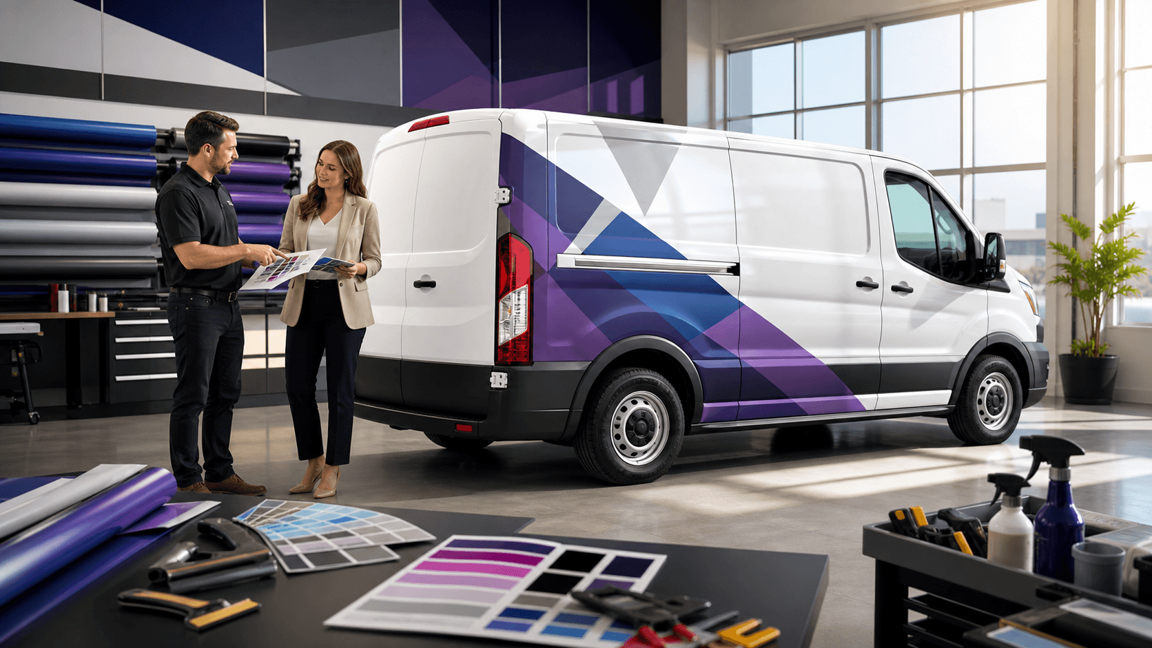
Mockups are a useful part of this work. Showing HOAs or property managers how a van will look in a driveway, from the street, or near a gated entry can smooth the approval path and lower friction for your drivers.
Putting Safety, Trust, and Clarity on the Van
Unmarked vans can make people uneasy, especially when deliveries happen at night or when kids are outside. Strong, clear fleet van graphics help customers recognize who is at their door and why.
Good safety-focused graphics combine visibility and messaging:
- High-visibility accents around rear corners and bumpers
- Reflective blocks or chevrons at the back for low light and bad weather
- Clear vehicle ID numbers and brand name on all sides
Short, plain-language messages can build trust without turning your van into a bulletin board. Common phrases we see work well include:
- Uniformed Drivers
- Tracked Deliveries
- No Cash Carried
- Caution: Frequent Stops
- Watch for kids at play, used more in summer and back-to-school periods
Placement is key. Safety and trust messages earn the most attention when they are put:
- On rear doors, near brake lights and handles
- Low on side rocker panels, near where people step in and out
- Close to eye height at the back of the van, not buried near the roof
We keep these notes short so they support, not compete with, your main branding. The goal is a van that feels seen, safe, and easy to understand at a glance.
Building a Scalable Last-Mile Graphics Playbook
One well-designed van is a good start, but last-mile work rarely happens with just one vehicle. Most brands need a system they can repeat across locations, vehicle models, and partner fleets.
A strong playbook usually covers:
- Standard layouts for each body style, like compact van, full-size van, box truck
- Approved color formulas and font rules that protect legibility
- Clear zones where local messages or safety notes can change
- Production specs so every panel lines up and looks consistent
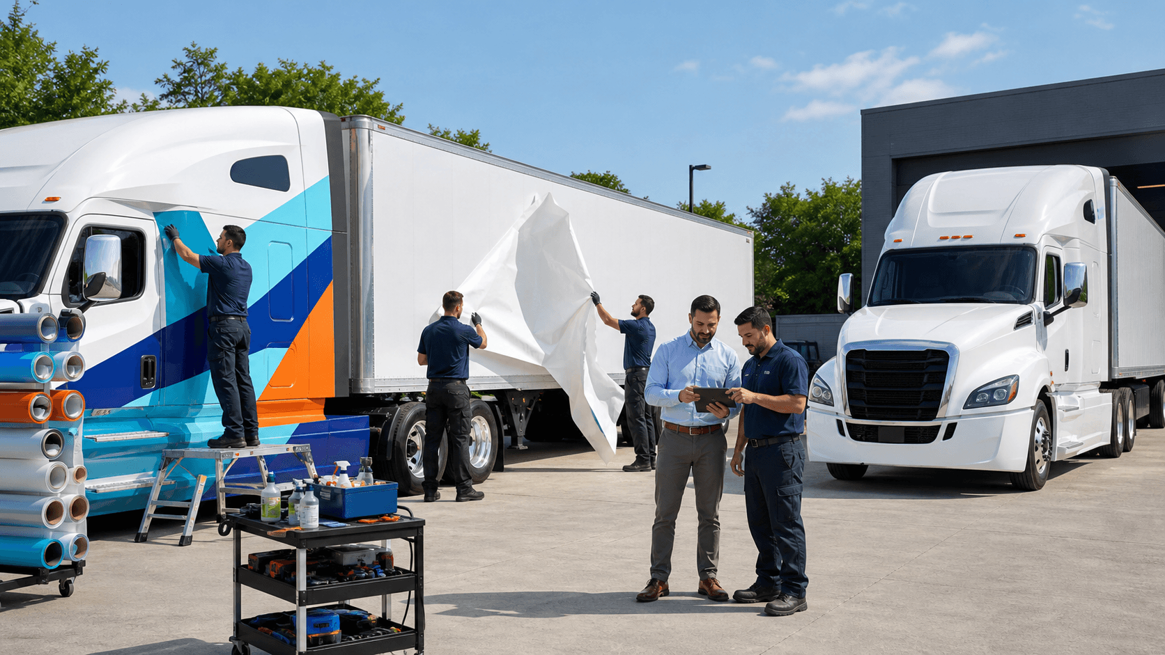
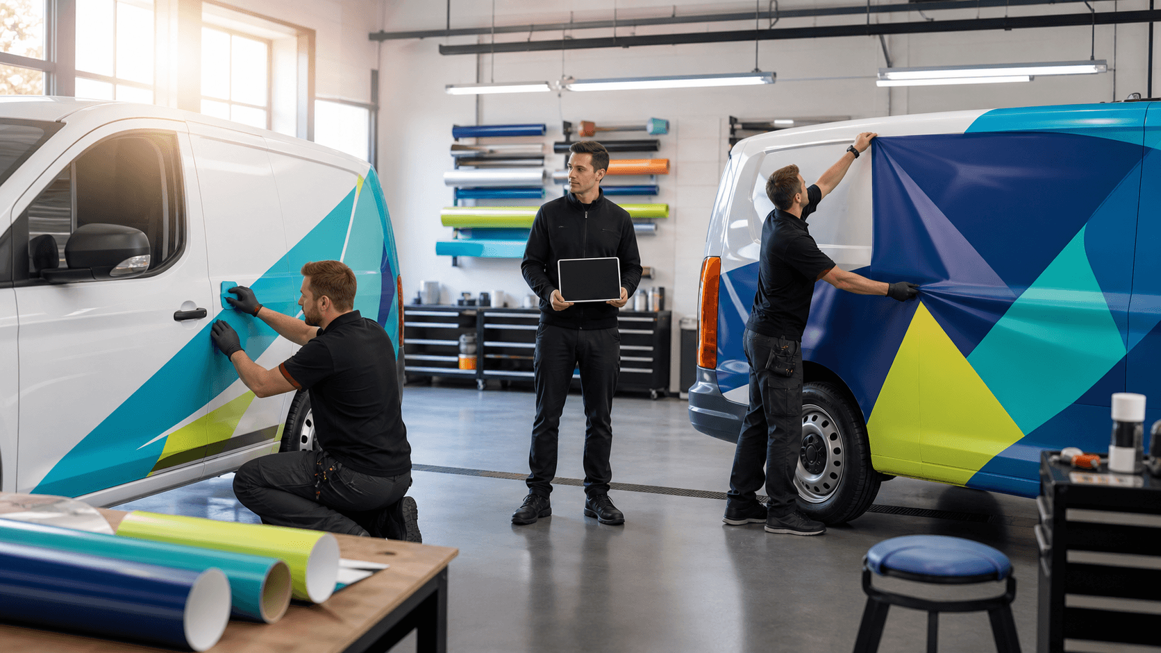
At AGS SEO, part of American Graphics & Signs, we bring design, production, and installation together for national fleets. That means we think about how a layout will wrap on different van bodies, how it will print, and how installers across the country can apply it with the same level of care.
We encourage teams to review their current doorstep experience with drivers, dispatch, and customer service staff. Where are customers confused about who is at their door? Where do HOAs raise concerns? Where do photos from the field make the brand look cluttered or unclear? When you turn those answers into a shared graphics playbook, every last-mile stop becomes a small, repeatable moment of clarity, confidence, and connection.
Get Started With Your Project Today
Bring your brand to life on the road with custom fleet van graphics tailored to your business and vehicles. At AGS SEO, we work closely with you to design graphics that reflect your message, attract attention, and stay durable in real-world conditions. If you are ready to plan your project or have questions about options, installation, or timelines, please contact us so we can help you move forward confidently.